

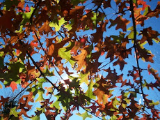
One of the projects I have to do is a working DVD menu. So far I have the main page. The background is a photograph I took last year around the same time in the season. I am planning on having the cluster of leaves follow either the mouse or remote to select either Play All, Select Chapter, or Bio. The last two options will go to sub menus.
Feedback I received is that the eyes first go to the title, and the first thing the user wants to click on is "Play" or the leaves above it, and the second thing is "Select Chapter." The responses for where the eyes rest were varied--"Play All," the path, the orange leaves, "it doesn't really rest," "Bio," the lower right, the center, and the shadows on the left.
Positive responses were that it is clean, good button over "Play All," good color scheme, nice picture, straightforward layout, good contrast, text and images work well together, and nice shadows around text.
Negatives and suggestions were pretty much unanimously that the center and right menu options are a bit hard to read. I have since darkened the background around the text more, as well as made the text bold so it is easier to read. If it is still hard to read, I will make the text one size bigger.


No comments:
Post a Comment